|
0 Comments
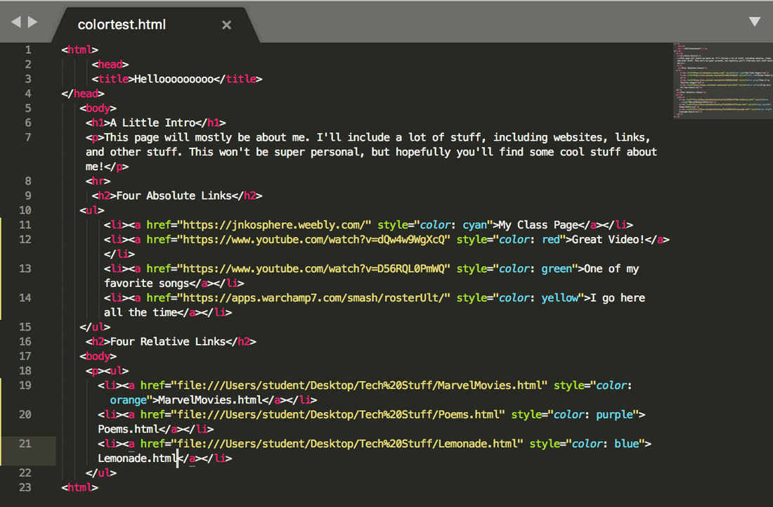
  This one, I have to admit, is a little repetitive, because I had to write <li> several times.
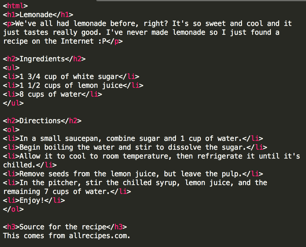
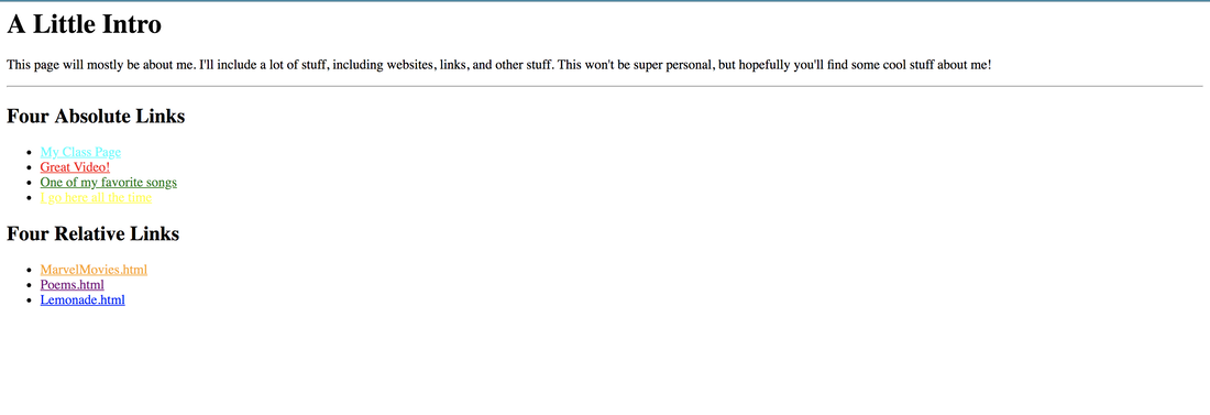
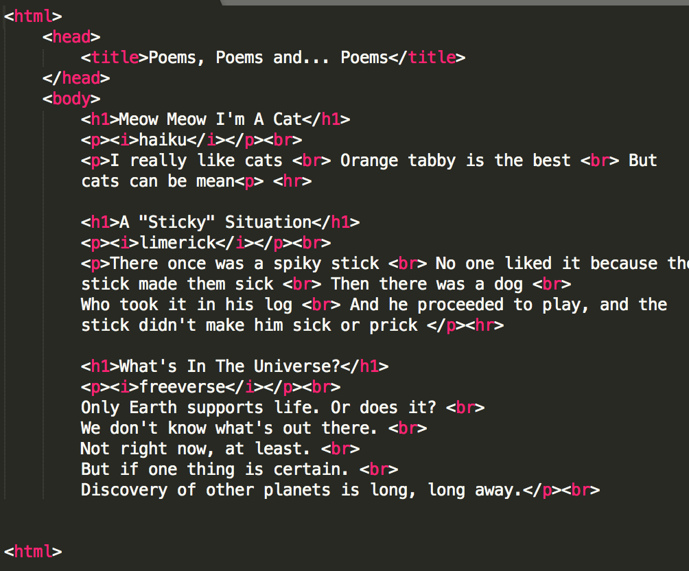
Also, here's the link to the recipe: https://www.allrecipes.com/recipe/32385/best-lemonade-ever/    This took a lot work, no doubt. What I'm amazed is that the code looks nothing but a bunch of nonsense, but when it's published, it looks like the picture above. Cool!
For my design, I had to create a logo of either myself or a career. For this, I chose to create a logo for a company that makes logos for other people. We needed to draw several logos, single out three, and create 3 variations for each logo. The frustrating thing was to come up with actual variety for the logos rather than just changing color. My favorite thing was creating the second set of logos, because I came up with great ideas for those. I learned that it takes a lot of effort to create good logos. I'm proud of myself for doing this. 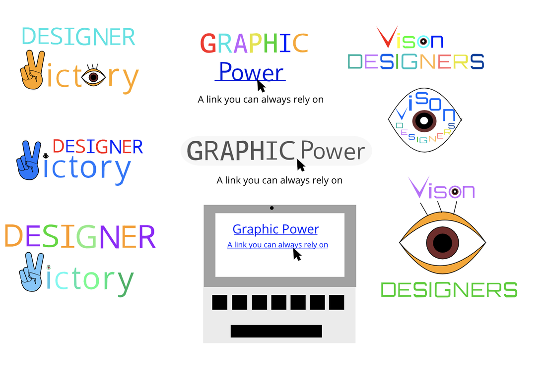 The final logo I chose is a brand called Graphic Power. The slogan is "a link you can always rely on" which represents my company for two reasons: one, it's a play on words because the logo shows a computer link, and the "link you can always rely on" represents that it's something that can always help you. This one is my favorite because I think it's the most well made out of my logos, and personally, I think it's the most eye-catching out of all of them, making this my favorite. 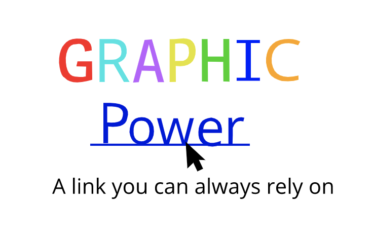 For this, we needed to come up with 15 words to describe either our company or ourselves. Then we needed to create 15 logos and create 3 that are the best in our eyes. The three logos I chose were the ones in circles. The images symbolize how whenever you create something original, you feel proud that you did it and no one else did. It's a victory. That's why there is a V-hand sign, because it means a victory, or a win. Some logos I like are the ones that are circled, because those are the ones I'm most proud of. Some I don't like are the ones on the beginning picture, because those are honestly amateur. The process was tedious, because I don't get that many good ideas. The worst (and most difficult) was coming up with the idea, because like I said, not many good ideas come to me. 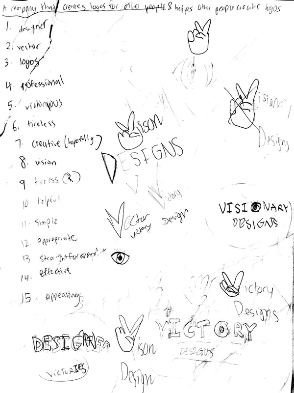 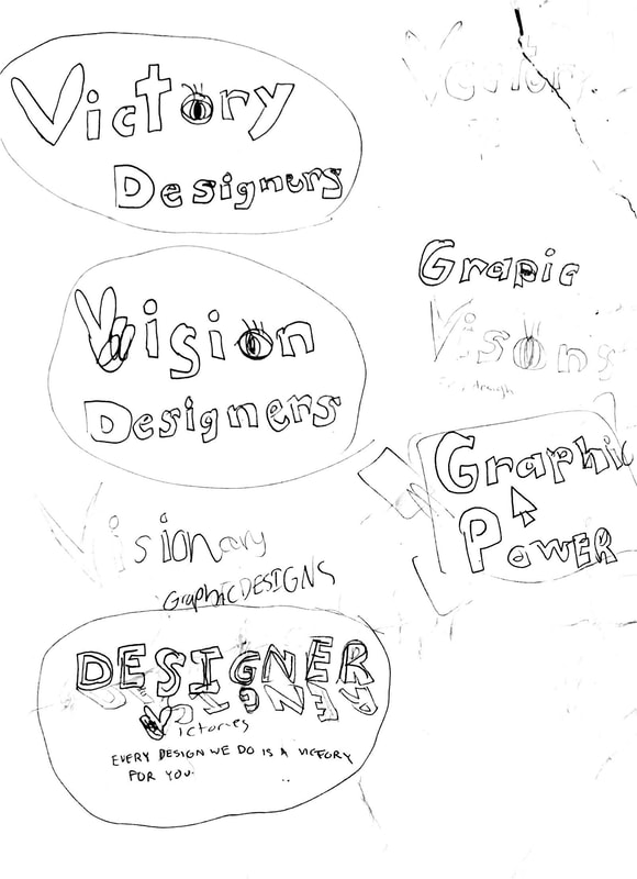 In Color Schemes, we were asked to create four palettes with the following schemes: Monochromatic, Analogous, Triad, and Complementary. We could do what we wanted, as long as they had these schemes. To do this, we needed Gravit Designer and a new resource: Adobe Color. There are four schemes: Monochromatic, which is one hue but with various saturation levels, Analogous, colors that are next to each other on the color wheel, Triad, where there are three colors evenly spaced around the color wheel, and Complementary, which combines colors from opposite sides of the color wheel. My favorite of them all has to be Monochromatic, because it can consist of one color, and that is blue. The fact that I can make a palette blue is awesome. My inspiration was a smiley face based on the typical smile emoji, just with different colors. If you see it, you can most likely connect it to that. 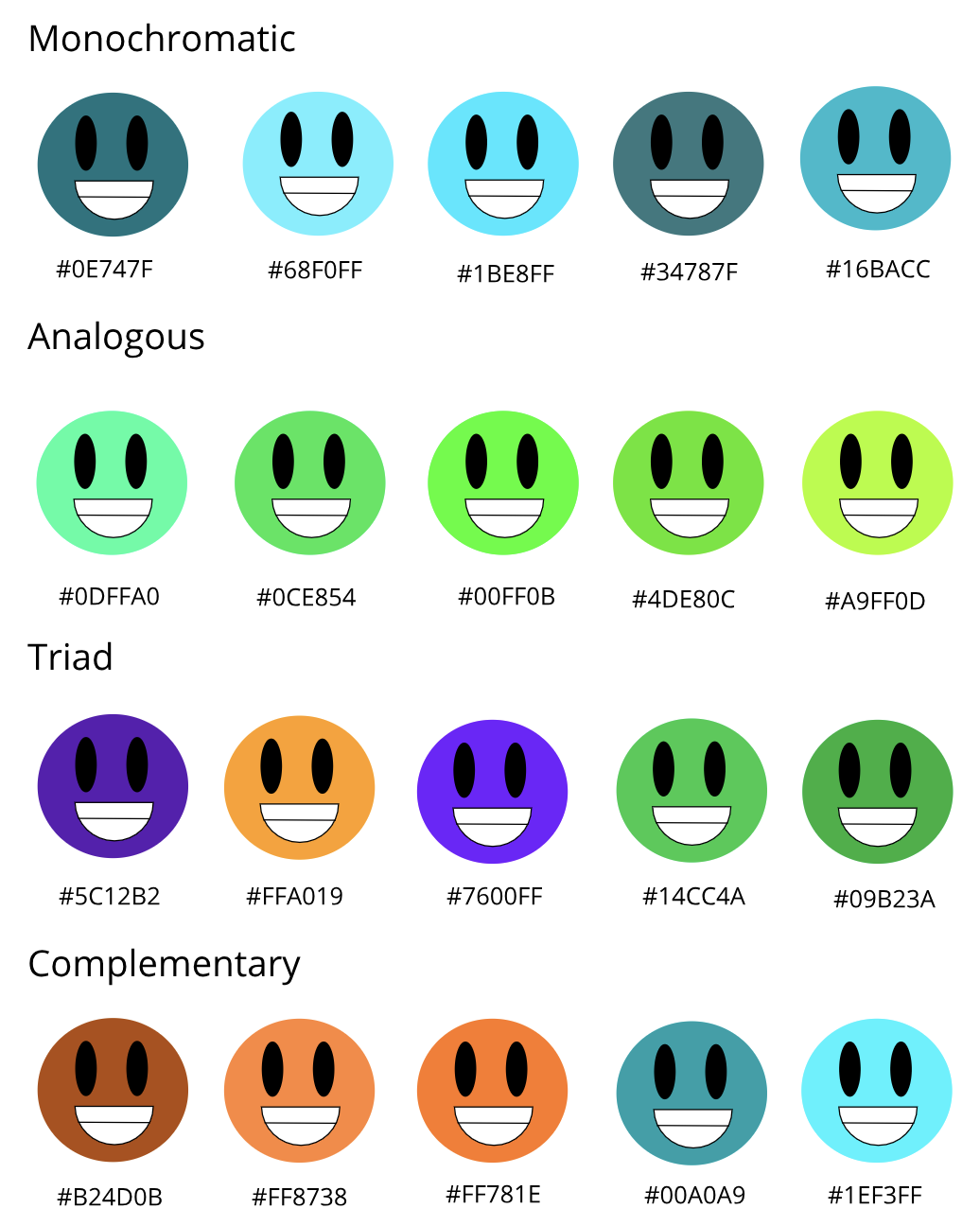 In "Color Names Summative," we were supposed to create some artwork in Gravit Design, and it was required to have at least 15 colors. In my case, my artwork featured different colored Pac-mans, (Pac-men?) and ghosts. I made my artwork using basic shapes like circles, rectangles, and other miscellaneous stuff like text boxes. You might be wondering how I created the gap in the mouth for Pac-man. I used the pen tool to create a shape so that I can place it directly over the circle to create the illusion of Pac-man. A challenge was, believe it or not, thinking of the concept or artwork that I could use. It was kind of stressful to come up with a good idea. I was determined to make my artwork unique. Simple, but not boring. Something that I could design well. And so, with a lot of thinking, I chose to make Pac-man the spotlight of this project. Some successes I had were the signs for the RGB and hex code. I wanted to include a lot of retro references in this, so I took the liberty of making signs like in Pac-man games and using an old game kind of font. I was proud of it. What I'm most proud of in my artwork is the pellets leading to the ghosts. I'm also proud that I left several Pac-man references in there :) 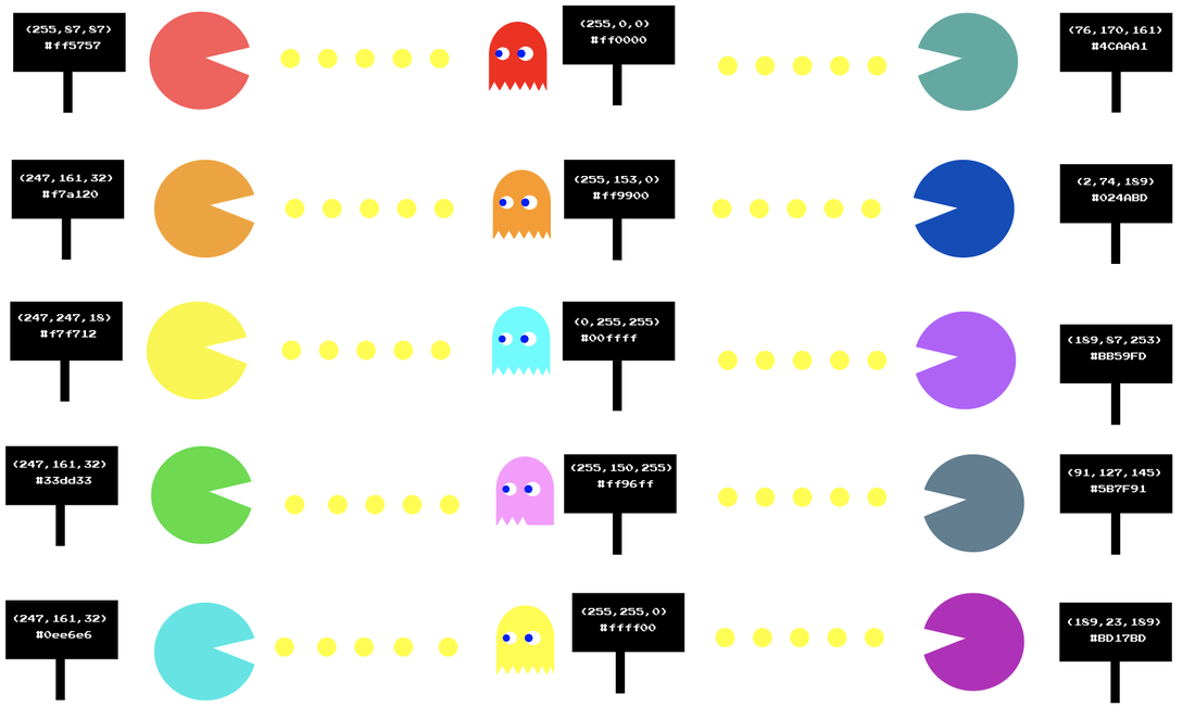 I learned a lot about Typography. Typography is, according to M. Butterick, "visual component of the written word," and it's important because it reinforces the meaning of text, like those of signs and titles. The quote "Each font has a personality and purpose" means that certain fonts were made for certain things. Take Comic Sans, for instance. Comic Sans is meant for non-serious matters, and it's a basically laid back font. But because it's been used on serious stuff, it has been hated, simply because it wasn't used for its purpose. There are five different types of fonts: Serif, Sans Serif, Monoscript, Script/Handwritten, and Novelty. Serif fonts are fonts that have "feet," which are points of the bottom of the letters. Serif is used for print and large blocks of text. Sans Serif is a font that is similar to Serif, but the letters have no "feet." The font I'm using, Quicksand, has no feet, so it's a Sans Serif font. Sans Serif is used all over the web, and it's great for titles, headings, and small blocks of text. Monospace is a certain type of font in which the letters use the same amount of space. It's not good for large blocks of text, but it's used in coding. Script, or Handwritten is a font where, hence its name, looks like it's been written by hand. These fonts are cursive or calligraphic, sometimes making it hard to read. It's perfect for large headlines and logos. The final typeface is Novelty. Novelty fonts are ones that are made to grab attention. They're flashy, but have to be used sparingly, because their popularity comes and goes. Typeface ComparisonWhat I was supposed to do for the Typeface Comparison project was to list the five typefaces (Serif, Sans Serif, Monospaced, Handwritten, and Novelty) write some text one of those typefaces, rinse and repeat, but with a different typeface. What I did is down below. 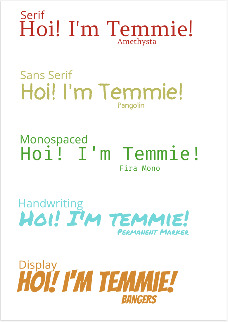 Word PortraitsIn Word Portraits, we were supposed to find ten fonts and list what word goes with that font, and list another word that doesn't. 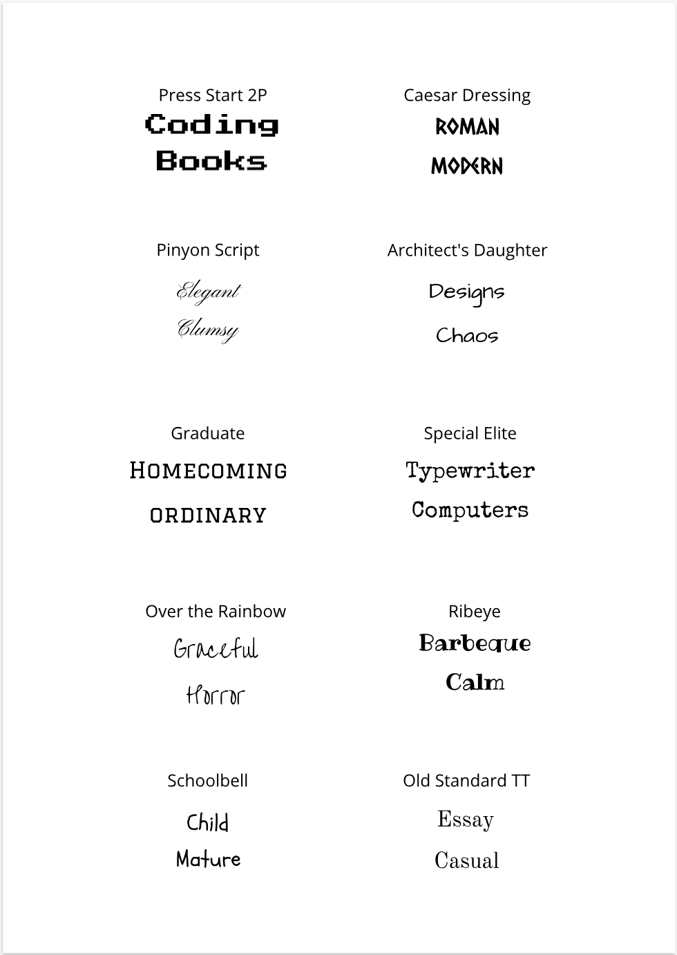 |
AuthorAbout me: I am author of this blog/website. Archives
April 2019
Categories
All
|

 RSS Feed

