|
For this, we needed to come up with 15 words to describe either our company or ourselves. Then we needed to create 15 logos and create 3 that are the best in our eyes. The three logos I chose were the ones in circles. The images symbolize how whenever you create something original, you feel proud that you did it and no one else did. It's a victory. That's why there is a V-hand sign, because it means a victory, or a win. Some logos I like are the ones that are circled, because those are the ones I'm most proud of. Some I don't like are the ones on the beginning picture, because those are honestly amateur. The process was tedious, because I don't get that many good ideas. The worst (and most difficult) was coming up with the idea, because like I said, not many good ideas come to me. 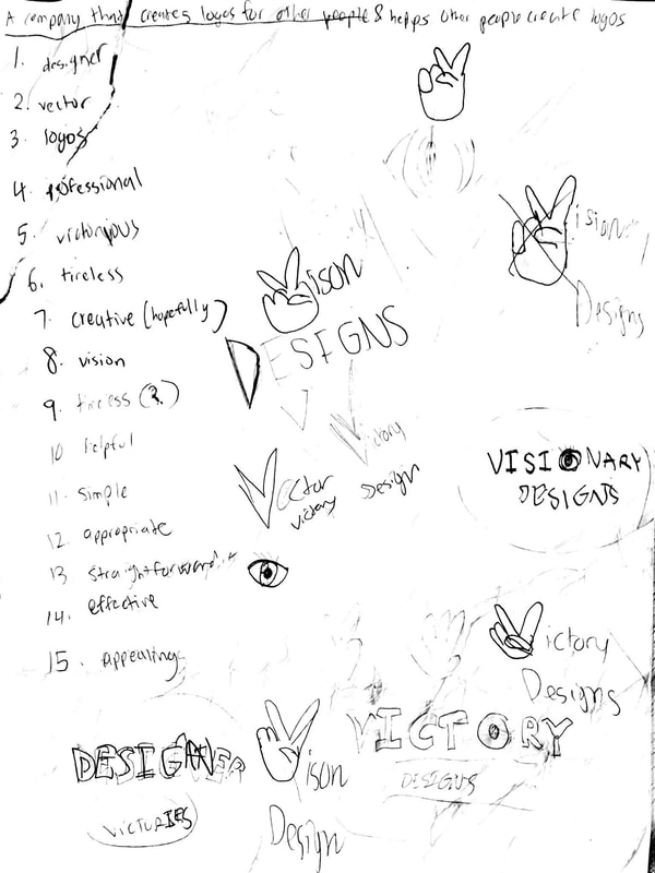 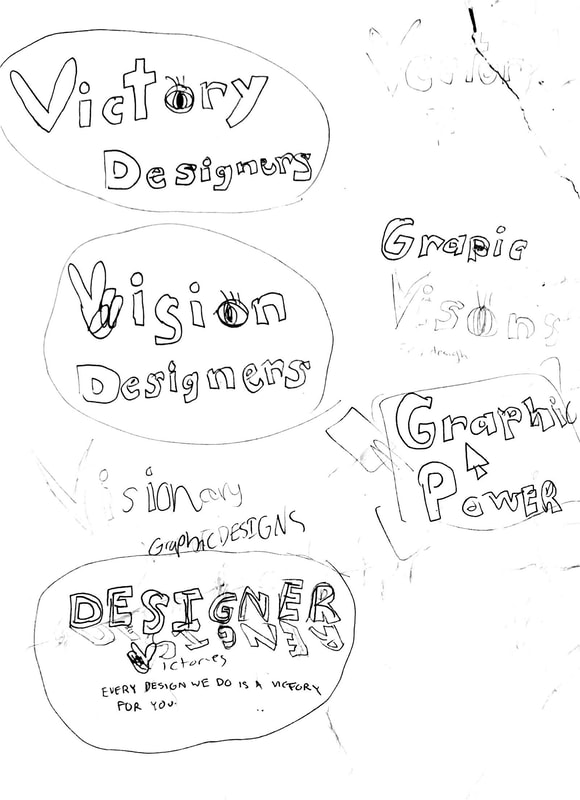
0 Comments
Leave a Reply. |
AuthorAbout me: I am author of this blog/website. Archives
April 2019
Categories
All
|
 RSS Feed

